From left to right: Rich Sommer, Elisabeth Moss, Aaron Staton, Bryan Batt, Vincent Kartheiser, Michael Gladis, and Christina Hendricks are part of the Mad Men cast that's raising the stakes for visually satisfying television. (AMC)
by Linda Holmes
The fawning over the attention to detail on AMC's Mad Men, which returns for a third season on Sunday night, can get a little precious, there's no question. When The New York Times spends an entire article discussing the creative process of simulating period cocktails and House Beautiful offers Mad Men-inspired decorating tips -- including a lead on a great typewriter for $140, because who wouldn't want that taking up some room? -- it feels a little fussy.
The thing is: it's all deserved, because this is the show that has made it harder than ever to claim that television is cheap-looking because it's television, and that it cannot be visually imaginative or interesting. It's the first show to build its reputation on its perfect look since HDTV came along and made that perfect look a much more important element of a high-end hour-long drama.

Christina Hendricks plays Joan Holloway. (AMC)
Look at office manager Joan Holloway (Christina Hendricks). To see Joan is to understand Joan, from the bold color of her dress to the red hair to the pen necklace. But mostly, just look at how everything down to the curve of her eyebrow communicates something. Joan has not just been made a woman of the 1960s; she has been made a very specific woman of the 1960s. It's not just about period pieces. It's about how a character's brand of energy is delivered in visual language.
There are a lot of shows that are good, and well-made, and well-written, and lots of them undoubtedly have hard-working prop masters and costume people who are brilliant and unappreciated. But it has been Mad Men that has, over its first two seasons, brought the idea of rich visuals to the forefront of television production and criticism like nothing else since the widespread adoption of bigger and better televisions.

This is the kitchen where the Draper family lives, far from the Sterling Cooper offices, where you know you would never see wood this color. (AMC)
The show's aesthetic is so important to its relationship with viewers that it fueled AMC's wildly popular 'Mad Men Yourself' campaign. It's one thing to get people interested in what they'd look like as a cartoon person on The Simpsons or as a Christmas elf, but it's another to simply have them so invested in your way of visualizing blood-and-bone, non-sci-fi human beings that they want to know how they'd look through your lens -- even if it's as a drawing.
It wasn't long ago that a frequent shorthand for the notion that a movie looked cheap was that it looked like television. But particularly in an era when a decent number of people either see HDTV or see shows like this on DVD or Blu-ray, there's no earthly reason television should look cheap unless it actually...you know, decides to look cheap.
Mad Men -- and, for that matter, Lost and Burn Notice and a number of other shows -- now feature distinct visual signatures that pop into your head whether you mean them to or not -- Lost is a leafy green show, to me, and Burn Notice is beachy and bleached out. This is more than the trendy Miami Vice flamingo stuff. It's not about having a look; it's about having a look that's been thought through.
More than ever, the best shows on television, like the best movies, have to think through visual style as well as scripts and performances. And what Mad Men has done to make it fashionable to engage in serious discussions about the rich look of a TV show can't be overestimated. Not every show can be a glamorous period piece and not every show can be shot in Hawaii (like Lost). But we've officially matured past 'TV looks bad because it's TV.' If it looks bad, it's because it looks bad. And if it looks like this, it's because somebody is working very hard.

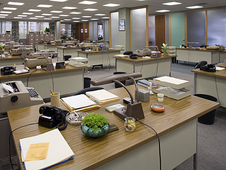
The curves, corners, and glass walls of Sterling Cooper offices say a great deal about what goes on in the place. (AMC)
"
